The 6 leading UX design examples to learn from in 2022

UX design is not just a fashion fad: it’s an essential element in the experience that users have with your brand and its digital products.
Knowing what are the hottest UX trends in meeting customers’ expectations is thus crucial for positioning your company as a leader in your field on a whole new level. Good UX design is the basis for improving customer retention, maximizing online sales, and boosting the overall profile of a brand — as it has turned into a selling point for customers of major brands.
The basic thing to keep in mind is why UX design is important - to offer users the best possible problem-solving in their interactions with your digital assets.
Our experienced designers at Resolute Software have shared their expert opinion: here are the 7 leading UX design examples that can lead your own efforts in 2022.
1. AR and VR design for ecommerce
IKEA is our top ux design example of using AR and VR in eCommerce — with its IKEA Place app launched in 2017. It allows customers to try out how their furniture pieces would suit their homes with a detailed explanation of their key features.
The Swedish furniture giant is far from being the only brand out there that’s benefiting from the AR and VR novelties in eCommerce. Fashion and apparel online stores also offer easy options to experiment with clothes and styles via good ux design. Furniture stores are using AR and VR for delighting users with a seamless way to decide on their home decoration — all that from the comfort of their homes.
2. Interactive design all across the board
There are countless examples of how brands are embracing interactive design principles to boost the way customers engage with their websites and apps. The Wix Editor for easy creation of websites is a prominent one, but the interactive design is practically everywhere across the internet.
Some good ux design examples in this field include:
- Scroll-triggered animations that introduce a storytelling element in the user interaction with a website for a more immersive experience.
- Cursor interactions that allow users to employ the mouse cursor in new ways — such as animated effects, search bar features, changing sizes and colors, and new intuitive actions it can implement.
- Micro-interactions that offer novel visual design ways for users to engage with websites and apps, such as ‘like’ buttons, swipes, hovers, animation effects, and more.
3. The power of simple design
Gone are the days of flashy and heavy design with a huge amount of elements, especially in the context of mobile device usage that runs the world. A good ux design example is, in fact, something simple that most users interact with on a daily basis — Google’s products. From Search to Mail and everything in-between, Google bets on basic colors, simple fonts, and an overall minimalistic approach.
The focus in 2022 and beyond is thus on clean and functional UX design. Minimalistic solutions can be spiced up with small visual elements that pop out to enhance user engagement. But still — the mantra is ‘keep it simple’ and any ux designer should know its specific ux principles.
4. Accessible 3D design
3D design is not a new thing on the ux designer ‘to-do list’ — but it’s been fully revamped as an approach in recent years. Check out the great examples of 3D design functionalities in the Adobe Illustrator app.
There’s a whole new generation of 3D design tools that make UX design appealing, engaging and accessible. The UX design process revolves around textures that are realistic and detailed 3D objects that can have layers, animation effects, shadows, and many other elements. These new 3D perks make websites and apps feel more real. In addition, 3D is rising to fame in AR and VR uses too.
5. Elegance with neumorphism
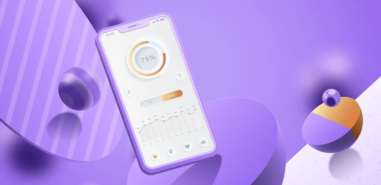
Neumorphism is an innovative visual design that is embraced by some and rejected by other UX designers. Check out some neumorphism UX examples, including Stripe’s landing page, Tesla smart app, and more.
In essence, neumorphism is based on flat design and skeuomorphism — making design elements resemble the real-life objects they represent. The style uses shapes, gradients, shadows, and the colors of background layers to make objects pop out. Neumorphism as a design process is close to 3D styling, but has a distinct feel about it that has especially elegant features.
6. Personalized experiences for the win
An essential part that distinguishes bad ux design examples from the great ones entails offering personalized experiences to users. The digital world is full of powerful examples of how a platform can have a personalized approach — from Netflix’s film recommendations to the Memories albums of Google Photos, and beyond.
In fact, personalized experiences are no longer an option to include — many users expect brands to have such features. With the growth of Artificial Intelligence, hyper-personalization (especially in the mobile experience) is becoming the norm. As companies collect various data about users, such as demographics and behavioral statistics, they can offer new experiences to their target audience tailored at the micro-level.
Get a trusted partner for your UX needs
At Resolute Software, we boast a team of highly experienced UX/UI experts who have successfully handled 100+ collaborations with clients worldwide.
Is there anything we can do for your brand’s UX? There’s no challenging task for us. Our expert design team would be happy to assist with the UX strategy, product and user research, and UX/UI design.
Get in touch with us and let’s discuss your UX strategy.
FAQs
The goal of user experience (UX) design is to create systems that are tailored to the needs of users, making their interaction with digital products seamless and smooth. UX is all about usability, accessibility, practical information architecture, and a great interface — based on extensive user research, user flows and user testing.
Good UX starts with a deep understanding of the user's journey when using a digital asset and applying ‘design thinking’ across the ux wireframing process - something that is often lacking in the bad ux examples. UX designers usually employ a thorough step-by-step process to devise the right strategy for each particular brand and its way of interacting with and having a huge impact on its customers.


