3 hands-on tactics to improve the UX of complex healthcare screens

Improved healthcare application design translates directly into better care for patients and reduced cognitive load on healthcare practitioners. Studies have shown that there are significant increases in performance and task completion when the aesthetics and usability of healthcare applications are improved.
And the need for good UX is significant. As the amount of data in healthcare increases, practitioners have to deal with it and find ways of making accurate decisions, without becoming overwhelmed. Here, healthcare applications that partake in the diagnostic and treatment process need to provide support, instead of further burdening practitioners.
There are several areas in which improvements in application UX can have quick and wide-ranging effects and benefits. These are:
- Аt the point of a practitioner’s contact with a system, i.e. in the immediacy of interaction and the context provided by the system
- At the point of integration between systems that enables practitioners to easily transition between them
- At the point of communication with other practitioners and patients that enables the flow of information and improves decision-making
In this blog, we will offer you a number of different ideas on how to improve healthcare applications in these areas that can provide significant UX benefits to practitioners. Keep reading to find out more!
1. Dashboards that provide data at a glance
First impressions are important, and while aesthetics are no substitute for functionality, improving the ways in which practitioners come into contact with an application and data has wide-ranging consequences.
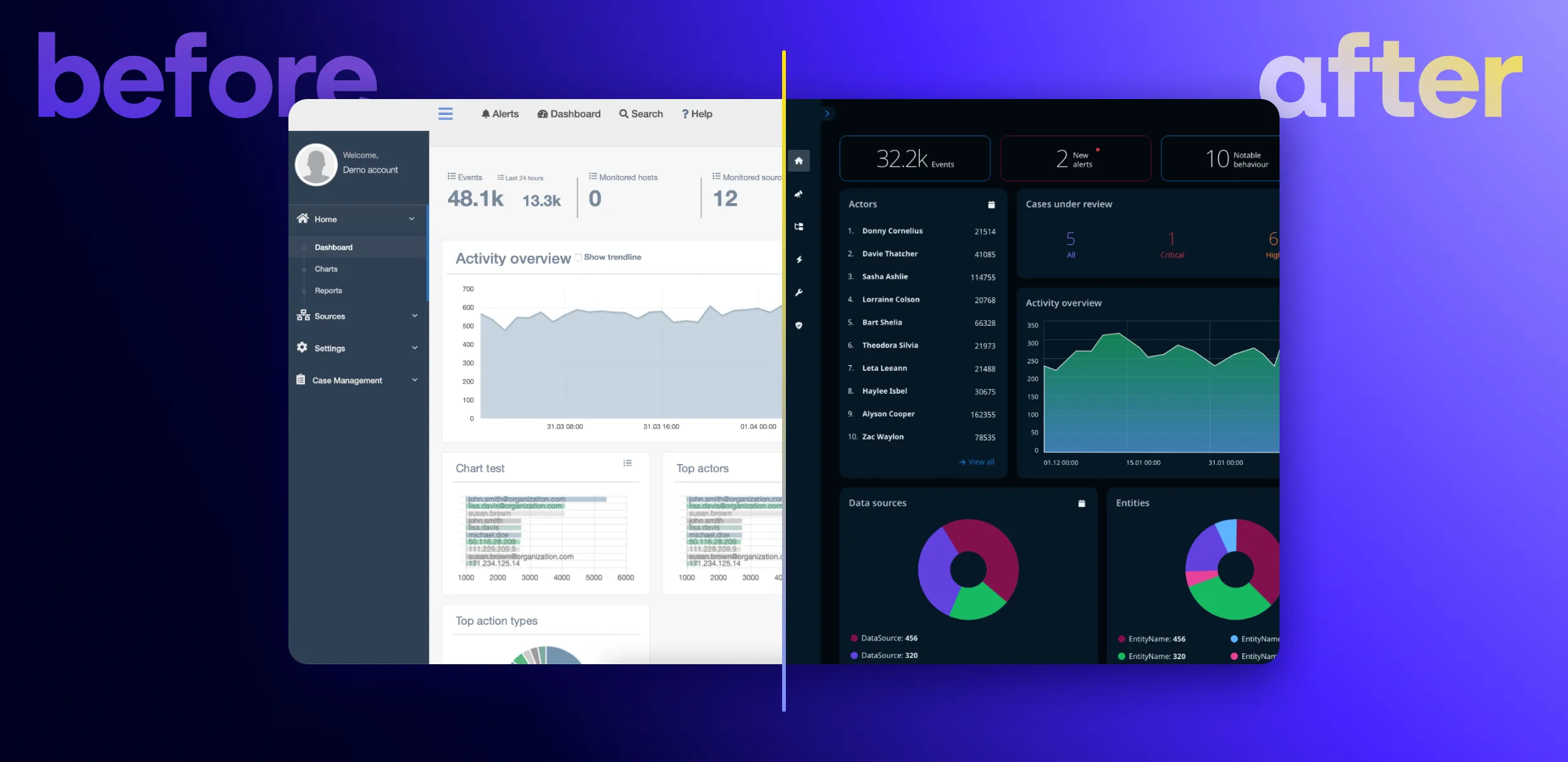
The purpose of dashboards and data visualization tools of any kind is to enable efficiency and inform decision-making. They need to achieve this by providing high-level, yet easily digestible, contextual data in real-time and at a glance.
There are different types of dashboards in healthcare depending on their purpose - clinical dashboards that provide information to practitioners regarding patients, and quality dashboards that provide information about the performance of a unit.
Clinical dashboards, such as those used in the display of patients’ electronic health records (EHR), are essential at any point in the process of providing medical care. They reduce the mental strain on clinicians, helping them to focus on the most important data points.
A dentist, for example, may benefit immensely from having a dashboard that visualizes each patient’s teeth, with comprehensive visual cues about the treatments that have already been conducted or where further work is required.
Quality dashboards, on the other hand, help to keep a focus on the overall workings of a hospital unit, such as a ward, and to spot and stay on top of performance issues. They help highlight inconsistencies in processes and practices, as well as education-related issues for staff, and leadership gaps.
Both studies as well as real-world implementations of dashboards show a consistently positive effect on different metrics. These examples show that clinical dashboards lead to reductions in time spent on data analysis and, hence, improvements in the sensemaking of data. Quality dashboards implemented in an emergency department, on the other hand, have led to reductions in time between arrival to triage, and arrival to provider in emergency departments. They have also led to reductions in left without being seen (LWBS) rates, and hence in an increase in revenue.
2. Integration between systems
To avoid incompatibility between systems, institutions will frequently prefer to adopt an entire product ecosystem. This streamlines communication and support with one provider, instead of scattering it between a number of providers. It is also more cost-effective due to the greater commitment made by the institution when adopting an entire set of systems and tools.
When creating healthcare product ecosystems, software providers have both a responsibility and an incentive to ensure that they are integrated with each other. It is not just the branded content and the color schemes that need to match. Instead, the logic of each application must follow a mental model that users can transfer from one system to the next. This guarantees that where several systems are in place, interactions across touchpoints will be predictable.
Instances in which such integration and coherence must be present include dialog boxes, interfaces, and navigation. Similar to learning to use an operating system on a computer or mobile device, these must be easily recognizable and enable users to move forward, rather than stumble in trying to make their way through the system. Where certain actions are automated, this must also be easily evident and expected.
Data visualizations must follow a similar logic, making it easy to discern the meaning of the provided data, regardless of the system or device being used. Where different devices are used as part of the diagnostic or treatment process, these too must offer a coherent and intuitive experience that largely or entirely eliminates the friction of shifting between them.
Ensuring such seamless integration within an ecosystem reduces cognitive load for practitioners and improves their satisfaction. It also helps institutions retain professionals and, in turn, leads to greater system adoption over time.
3. Easy communication between professionals and with patients
Communication is a third area in which certain simple functional and design improvements can lead to long-lasting results for practitioners and institutions.
Integrating a communication channel can enable professionals across the field or different parts of the diagnostic and treatment process to exchange information. For example, a radiologist may want to get a second opinion on an MRI scan from a colleague. Using the same system in which a patient’s data is stored, they could attach the scan and assign it as a task to their colleague in preparation for the consultation with the patient.
Such a feature may also include options for remote collaboration via audio, video, and even AR with colleagues from other hospitals or who are not currently on duty. This feature may help practitioners to plan interventions, such as surgery, discuss important details, and probe each other’s experience in providing the best possible treatment for a patient.
Communication between patients and doctors may similarly be improved via such a feature. The term patient portal is sometimes used to denote a portal in which practitioners have quick and easy access to patients’ data. It is also used to mean a portal to be used by patients to communicate directly with clinicians and to easily gain access to personal health-related information.
On the client-side, patient portals improve patient-provider communication, allowing patients to seek help for non-critical issues. This empowers individuals to stay on top of their health in a simple and straightforward way and even encourages the adoption of more positive health behaviors.
On the side of clinicians, a patient portal provides an immediate snapshot of the current status of a patient at the point of care - their health records, examination status, diagnosis, treatments, results, etc. And, when used as a communication tool, a portal helps free up practitioners’ time to consult patients with more acute needs in person.
Improve the usability of your healthcare application with Resolute
We at Resolute Software have extensive experience in offering digital modernization and transformation to healthcare organizations. Our work in healthcare spans the range from modernizing a legacy desktop application of a global manufacturer in diagnostic imaging to helping a global health information organization launch an app at the start of the pandemic and many more.
Are you looking for a trusted partner to help you improve the UX of a healthcare application? Get in touch with us to discuss your business needs and let’s see how we can help!


