Mobile UX design deep dive: 7 core principles

It’s common knowledge that mobile phones are quickly becoming the most popular type of device for consumers. In the span of five years, between 2016 and 2021, global mobile usage has nearly doubled, reaching almost 6.3 billion users in 2021. And during that same period, global mobile app downloads grew from 140 billion to 230 billion annually.
One of the reasons users are turning to mobile devices in droves is the enhanced functionality and design. The mobile device is fast, easy, and efficient and it satisfies users’ desire for instant access to information and services.
Naturally, all of this is good news for app developers and publishers but it also means there’s a lot of competition for people’s attention and users expect you to deliver. This is where mobile user experience (UX) and mobile interfaces really matter and play a vital role in an app’s success or failure.
In this blog post, we will review some of the most important mobile UX design practices. These have established themselves over time as key in designing apps that provide a high-quality user experience and make mobile users stay.
The most important mobile UX design principles to follow
There’s a good reason why there is such an emphasis on usability and efficiency in mobile ux design. Neuroscientifically speaking, our brains have evolved to conserve energy and use it as efficiently as possible. So much so, that they seem to predict perceptions in advance, based on prior knowledge.
This is why the mobile ux design really is such a big deal. Good design is informed by the idea of the “lazy brain”. It applies mental models that accommodate our need for predictable, seamless, and fast interactions. And, as time has proven again and again - that works especially for mobile apps.
That said, here are those mobile ux design principles that will improve mobile usability and make users enjoy using your mobile app more.
1. Navigation
Good navigation menu design enables users to interact with your app with ease and speed. Navigation provides access to different functions of the mobile app and guides users through all the stages of interacting with your product.

There are many ways to tackle the mobile ux design question of how to display navigation in a way that is helpful and doesn’t impede the use of the rest of the application. Some good navigation solutions include:
-
Tab bar
Also known as a tabber, this allows users to navigate with one hand and provide a quick and easy way through a mobile app. However, for menus with more than a handful of items, this is not a good approach.
-
Drawer
Keeping the menu largely hidden and opening it up like a vertical drawer when needed, provides more space for the rest of the app and reduces distractions. This approach makes sense when mobile users prefer not/don’t need to use the navigation constantly.
-
Hamburger
The hamburger is another efficient and visually beautiful way to tackle the question of too many menu items. The navigation patterns remain discretely concealed behind a menu button and unfold in a layered way as people click through.
-
Cards
The card design operates by displaying concise and clear content on a single topic, along with a number of relevant actions on the mobile phone. It provides an interactive yet intuitive ux design that simplifies interactions and keeps them tidy.
2. Icons and symbols
Given the limited space, symbols and icons are made much use of on any mobile device. They are great for communicating information at a glance. For that purpose, though, they must follow a number of principles:
- Clear and readable: symbols must communicate their concept with clarity. Where used, non-universal symbols should be labeled in a readable way, in order to aid understanding.
- Aligned: minor misalignments can disturb vision and create discomfort. Icons must therefore be adjusted and balanced carefully.
- Simple and consistent: symbols must be as simple and “brief” as possible in communicating their message and must adhere to the same stylistic rules. This reduces cognitive load.
- Unique: providing each icon with a personality helps with recognition but also communicates a certain feeling tone that creates familiarity.
All of the above make icons easy and convenient to use in your mobile ux design and increases usability.
3. Speed
Since mobile device usage is popular exactly because it offers speed, app speed of use is something to watch out for. Here, too, several rules can be applied to guide your mobile app design process.
Speed of use refers to the minimum amount of time required to perform a task within an app, including the actions to get to the task, as well as recover from errors. To achieve better speed, here are a few things you should do with mobile apps today:
- Create larger and finger-friendly tap targets
- Minimize the movement from one item to the next based on usage patterns while leaving enough room to avoid misclicks
- Make good use of the areas that are easiest to reach (usually with the thumbs)
- Tailor muscular effort according to the effects of action - make actions with greater consequences slightly harder to execute to reduce unwanted effects
- Offer one primary action per mobile screen with no more than one call-to-action to avoid choice paralysis, reduce time and cognitive load
- Provide a clear, logical, and easy path to the content that users want to reach
- Improve layout to make text easy to scan
4. Consistency
There are two forms of consistency that you must keep in mind when it comes to why is ux design important for mobile apps - external and internal.
External consistency refers to the fact that users will spend most of their time outside of your app. For that reason, they will already have expectations about how the app is supposed to work. Internal consistency refers to using the same structure and patterns within the different parts of the app - such as keeping navigation controls in the same place.
By designing your app according to familiar patterns and maintaining consistency throughout, you will enable users to predict how they are supposed to act. This reduces problem-solving responses and makes the users’ mobile experience smooth and seamless.
5. Feedback
Lack of (clear) feedback can increase so-called interstitial anxiety (i.e. the tension between an action and the app’s response) and confusion regarding the effect of an action. This can force users to take further and unnecessary actions.
Do your ux research and use different forms that provide feedback - visual, sound, or haptic - to confirm that user input has occurred. Always collect valuable feedback and make sure you do usability testing. It eliminates the need to guess whether an action has been successful or not. Loading animations or gradual transitions between elements, rather than a blank or static screen, are also a type of feedback. These communicate the status of the app and its operations. Both forms of feedback help users feel in control and reduce uncertainty.
6. Input
Requiring a lot of input can be frustrating due to the limitations of mobile devices and also reduces usability. It’s, therefore, best to keep typing to a minimum.
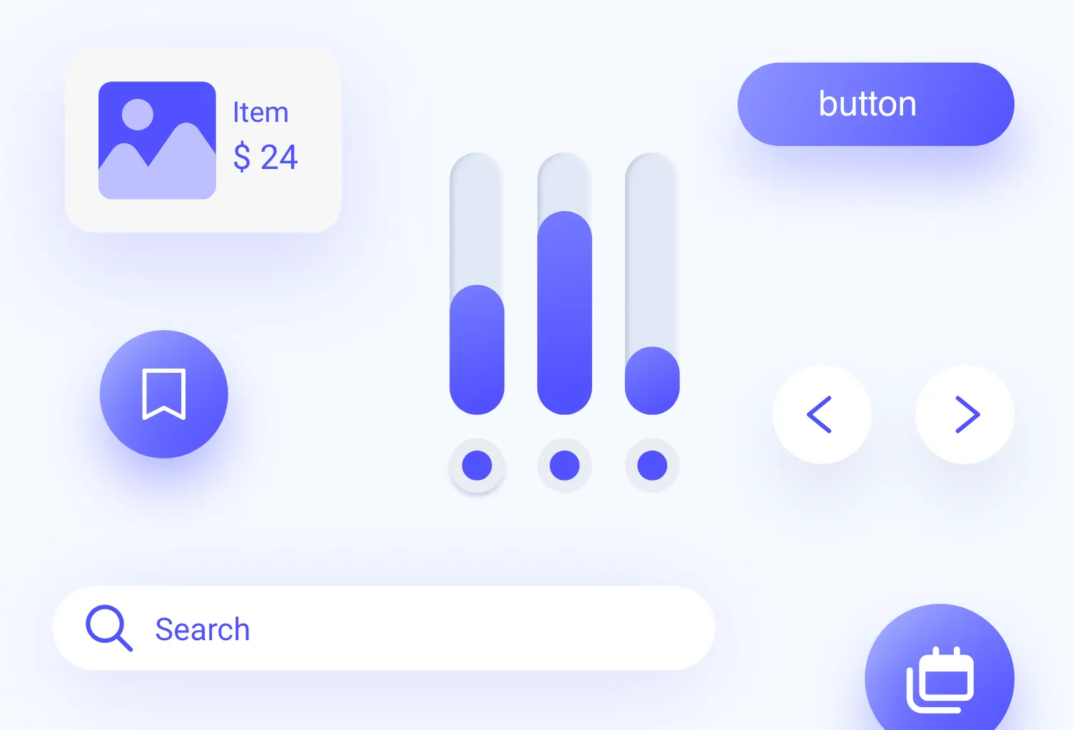
You can reduce such input by pre-filling forms where possible, offering auto-complete, or providing lists (drop-downs) of predefined options. Where input is required via typing, try to keep forms as short as possible, and request only the most necessary information.
7. Testing
User testing in mobile ux design is the cornerstone of usability and can help you spot all the flaws that may not be evident to you as its designer. It’s also a core part of the ux principles we follow day and night, no matter if it’s a mobile design project or not.
Ideally, conduct tests at every stage so as to filter out issues early on, and keep testing after the launch. Conduct tests on different mobile devices and with different users, asking them to perform a variety of tasks.
This will help you iron out the kinks and can significantly increase usability. App analytics and user feedback are a further source of information about how you might improve, so make ample use of these data points too!
Boosting your app’s UX with Resolute
Getting a good sense of the usability of one’s app can be difficult when you’re in the middle of the ux design process. This is where an outsider’s input and assessment can be really helpful to make sense of what works and what doesn’t.
Resolute Software can provide you with a custom UX assessment that is based on qualitative as well as quantitative research. With over 100+ completed UX projects, our UX professionals bring their in-depth understanding to the table to help you create an app that is customer-centric and future-proof!
Get in touch to learn more about how Resolute can help you.
FAQs
UX designers are part of the app creation but aren’t as involved as mobile web developers. The mobile ux design is a unique input that helps plan and design the product’s structure, develops user flow and prototypes, conducts testing, and continuously improves the usability of the app. UX mobile designers work together with UI designers, developers, and a host of other professionals.
Designing an app usually passes through the following main stages: ux research and competitive analysis, architecture design and wireframing, mockups and prototypes, testing, and rollout.
The UI design is the part of the mobile ux design process in which the user interface is developed. It focuses on creating interfaces that users will find easy and convenient to use. UI designers consider what users might need or want to do and create a mobile interface that will enable them to do so as simply as possible.


