Design
Scaling web accessibility: Inclusive learning by design

In a recent live-streaming event honoring GAAD (Global Accessibility Awareness Day), organized by Progress, Diana Tashkova, a UX/UI designer from Resolute Software, and Alyssa Nicoll, a Senior Developer Advocate at Progress, engaged in an enlightening conversation that highlighted the growing importance of accessibility and its integration into design systems.

While still often overlooked, accessibility is moving beyond a buzzword to a fundamental design principle and a standard expectation in the industry. Accessibility is no longer merely a legal obligation nor an optional consideration for small businesses or those who believe their audience does not include disabled individuals. Businesses that thrive are those that offer inclusive experiences and equality to everyone. Overlooking specific physical or mental impairments, combined with failing to understand the impact of situational disabilities, can alienate potential users. Recognizing these factors ensures your design accommodates everyone, providing a seamless and inclusive user experience.
While accessibility enhances the user experience for everyone, design systems ensure consistency, quality, and smooth collaboration across design, development, and product management teams. Accessibility-enabled design systems, therefore, create a cohesive and inclusive digital environment.
Diana defined a design system as “the single source of truth for all the teams involved in software product development—designers, developers, product managers, everybody." This holistic approach ensures consistency and quality across all product elements, but a critical question is also raised: “When is the right time to start thinking about accessibility?”. The answer is both encouraging and pragmatic. While it's never too late to begin making a product accessible, integrating accessibility from the start is far more effective and less costly. Early incorporation prevents the need for significant, resource-intensive changes later on.
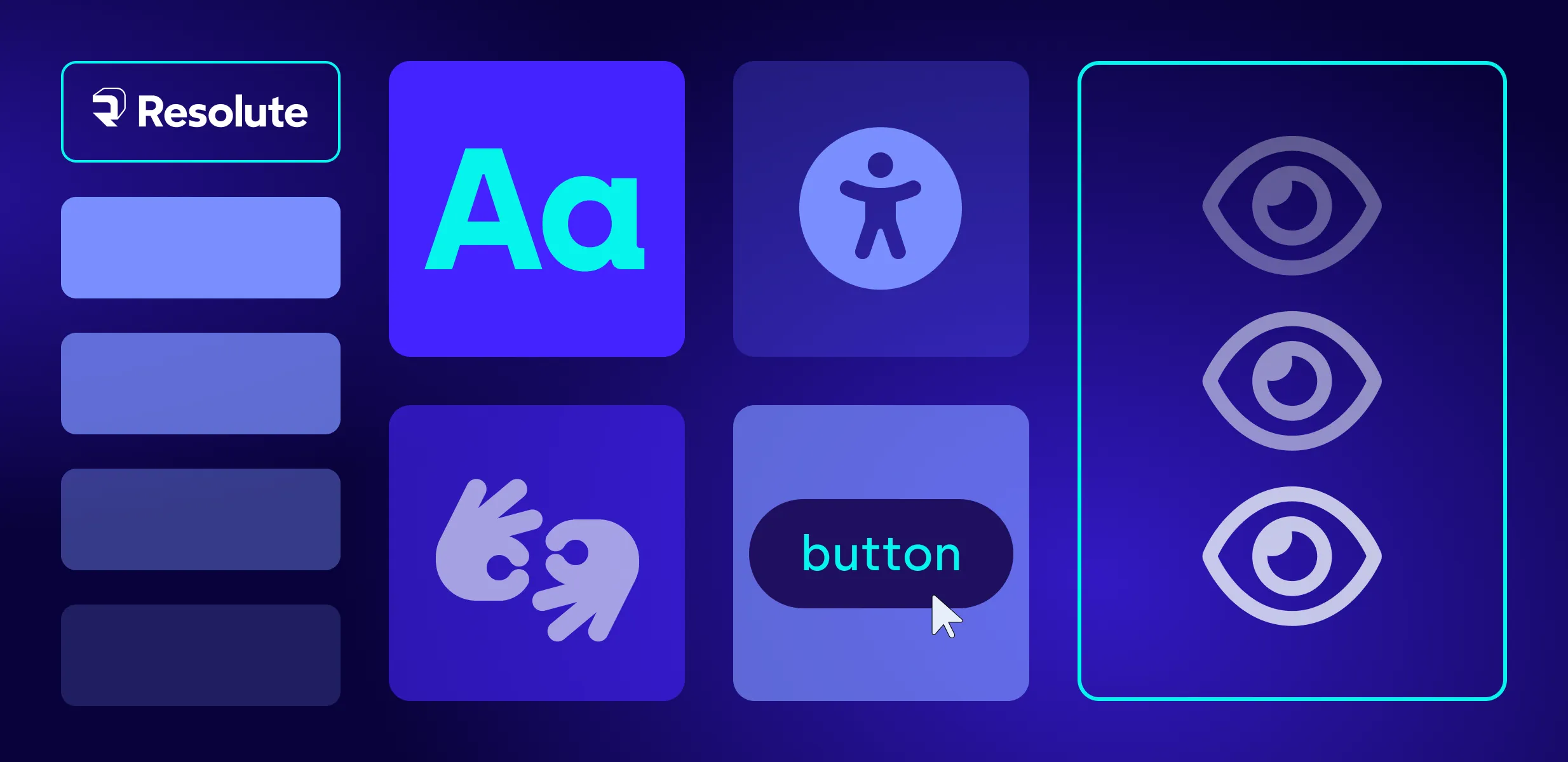
Diana highlighted several core components of a design system—colors, typography, copywriting, spacing, UI components, and layouts—each with unique accessibility considerations.
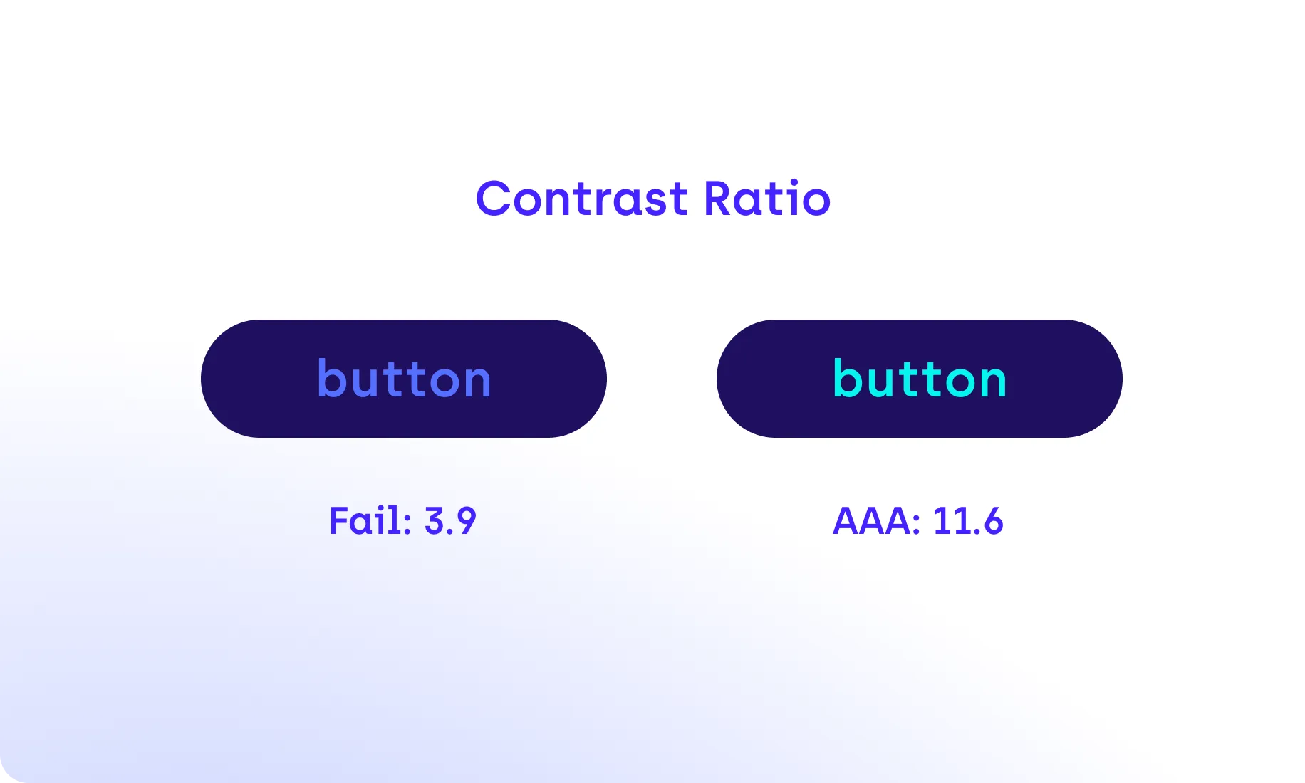
Color selection can be deceptively simple yet challenging. Ensuring proper contrast ratios is vital for readability, benefiting not only those with visual impairments but also those affected by situational disabilities due to environmental or situational factors. For example, appropriate color contrast might help someone outside who is having trouble reading the text on their device because the sunshine is too bright.
However, relying solely on color to convey information and meaning can be problematic because many people cannot perceive color or have limited color vision. Additionally, colors can have different meanings across cultures. Incorporating visual cues like icons, text labels, and underlining links can enhance visibility, comprehension, and usability.

Clear call-to-action (CTA) buttons are also crucial. Users need to fully understand the actions they are taking, so avoiding vague labels and using descriptive text can significantly improve the user journey.
Consistency in button colors and styles throughout the design system reinforces brand identity and enhances accessibility.
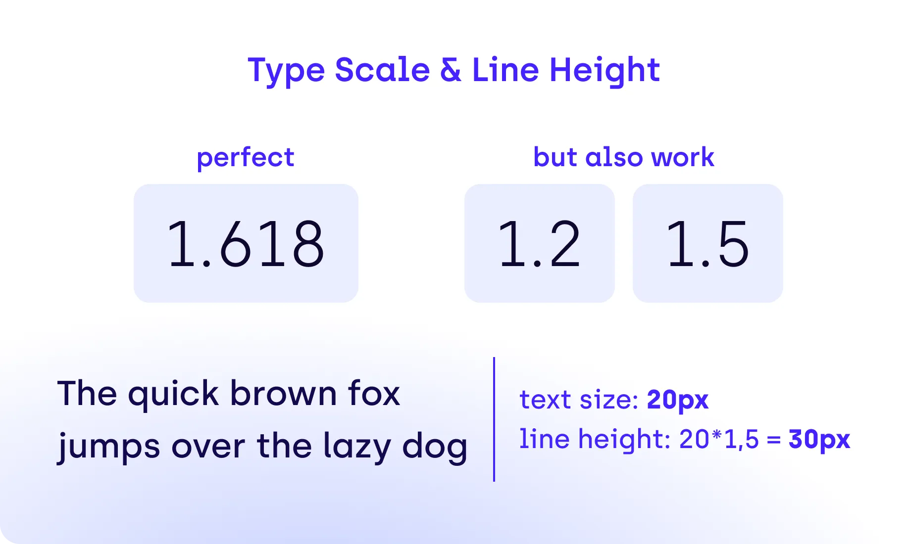
Good typography enhances readability and inclusivity. Diana cited alarming statistics estimating that approximately one in ten people have dyslexia, and most are not even aware. This makes font choice critical. She recommends fonts designed to be dyslexia-friendly and emphasizes proper kerning and line height to enhance legibility. "Quality fonts can significantly improve UI," she said, sharing her own 'magic numbers' for line height based on the golden ratio.
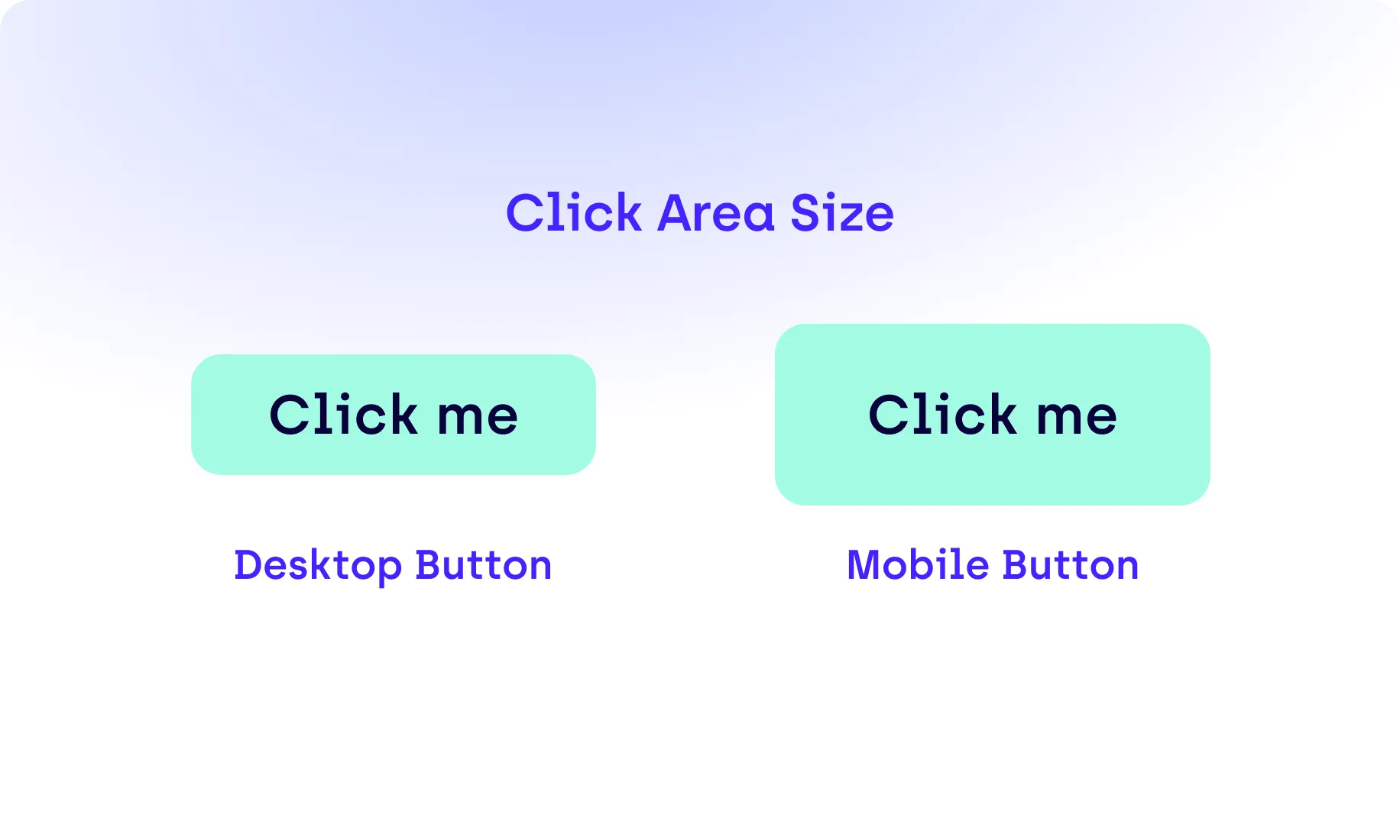
When designing UI components, various factors must be considered to ensure accessibility and a seamless user experience. It is important to adjust the click area size for different devices, as mobile components should have larger click areas because users’ thumbs are larger than a computer pointer.
Responsiveness is also crucial in terms of shrinking elements to fit smaller screens and reordering them to maintain logical flow and readability. For example, an image on the left and text on the right in a desktop view should stack vertically on a mobile device to keep the content easy to follow.
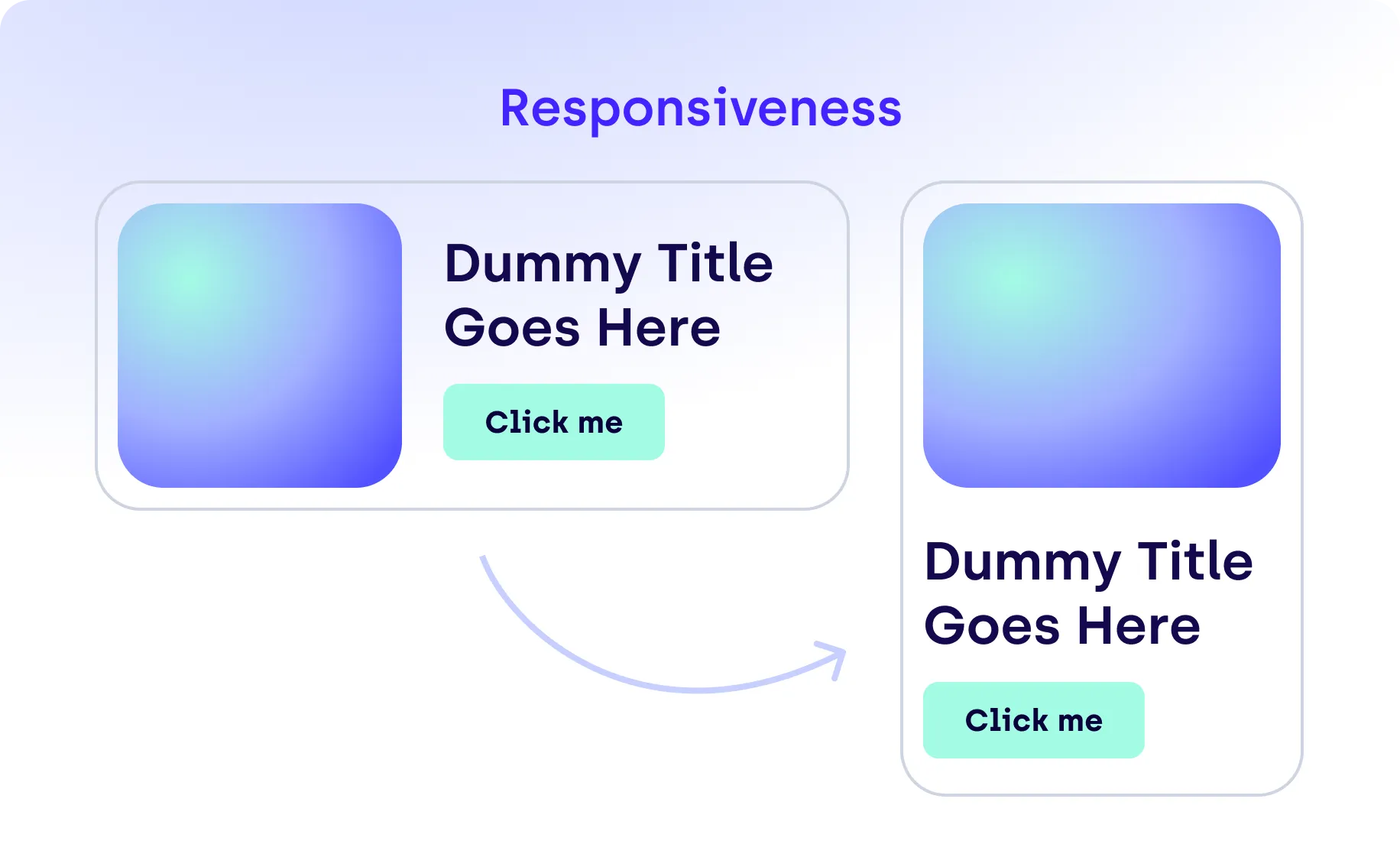
Drastically changing layouts can confuse users and complicate development, so maintaining a consistent design across devices is essential.
Maintaining consistency in interactions is equally important. Using the same solutions to solve the same problems across all devices and screen sizes ensures users become familiar with the product. This approach not only enhances accessibility but also improves the overall user experience. Accessibility directly translates to a better user experience, reinforcing the importance of making products inclusive for everyone.
Finally, Diana concluded with three guiding principles:
She said, “Our differences are the key to making great products.” This mindset drives better design and fosters a more inclusive digital world. These insights underscore the vital role of accessibility in modern design systems. By integrating these practices, designers can create more inclusive, effective, and enjoyable user experiences for everyone.